Record Label Logo Analysis
Island Records was founded in 1959 in Jamaica by Chris Blackwell, Graeme Goodall, and Leslie Kong and has been based in the UK since 1962, at the time it was one of the biggest record label companies, and is now a division of Universal Music Group, one of the largest record companies. The name 'Island Records' derives from Harry Belfonte's song 'Island in the Sun'.
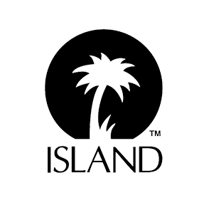
The simplistic logo in black and white portrays a professional look for the company. The simple shapes of a circle could represent the sun which shows that the company is rising above other companies showing they are better and bigger. The noun 'Island' is in capital letters on the logo at the bottom, the capital letters ensure the name stands out, as it is important for the public to know and recognise not only the logo but the name as well. The colour black connotes the unknown, showing that the record label are unexpected and exciting. Artists who are signed to them include Justin Bieber, Bob Marley, Amy Winehouse, U2 and many more showing the diversity of the record label. The record label logo does not represent a certain type of genre, therefore appealing to a mass demographic audience.

Syco Music, also known as Syco Records, was founded by 2002 by Simon Cowell, therefore it is a UK based record label. Syco music is a subsidiary of Syco Entertainment. The label has the automatic right to sign the winners and runners up of The X factor and Britain’s Got Talent, therefore they appeal to a younger audience with the demographics of young teens to around 30 years old. The colours used are golden yellow and grey, the use of the golden yellow on the 3D sans serif text makes the record label seem powerful and illuminates everything around them. Therefore they make everything better, including their artists, showing they have aspiring artists that will be great in the future. Their artists include mostly X factor winners/runners up; Leona Lewis, One Direction, Little Mix, Ella Henderson, Olly Murs, as well as these people they also represent Labrinth, Fifth Harmony.
The use of the grey lower case letters makes the 'SYCO' stand out more, and the use of sans serif makes it appeal to a younger audience demographic, also it is still a mass audience since the grey ensures the record label is still taken seriously and seen as professional. The name SYCO is normally seen to have come from the founder of the record label Simon Cowell, using the beginning of first name and the beginning of his last name. This makes the record label appear to be more personal and ensures the audience that the record label is trustworthy.
The colours used are unconventional for a logo of a professional and well known record label, however it shows that they wish to stand out from the crowd and not be like everyone else.

Virgin Records was founded in 1972 by English entrepreneur Richard Branson, Simon Draper, Nik Powell and Tom Newman, therefore it was a British Record Label when it first began, however it is now defunct in the UK since being purchased by EMI in 1992 then by Universal Music in 2012. The record label is still active in America under the name Virgin Records America. The name 'Virgin' derives from the fact that Branson and Powell were new to the business of music, therefore being like 'virgins'. Powell and Branson also had a record shop before they started the record label, of which was called Virgin Records and Tapes, therefore showing they had a passion for the music industry. Virgin Records have had a wide variety of artists such as Spice Girls, Rolling Stones, Katy Perry, Jared Leto and many more.
The black and white basic colours show the professionalism of the record label, as the colour black connotes elegance and power, showing that Virgin Records is an important business, with important artists. The colour white has connotations of innocence and new beginnings therefore fitting with the name 'Virgin', it also shows customers that they should be respected and are once again professional. The font of the word 'Virgin' looks like it has been hand written with an ink pen, therefore making the record label seem personal, creating a connection with the artists and audience. The use of a capital ‘V’ and the lower case of the rest of the word once again shows that the record label is normal showing the youthfulness, however the upper case of the word ‘Records’ reinforces that they are serious about the business, along with the sans serif font.

Atlantic Records is a record label of which is mostly famous for representing rhythm and blues, hip-hop, jazz and rock and roll artists. It was founded in 1947 by a Turkish man who lived in America, Ahmet Ertegun and a dentistry student; Herb Abramson. They signed many famous African-American musicians such as Aretha Franklin, Ray Charles and Wilson Pickett. The record label is now a subsidiary of Warner Music Group, this is when Atlantic began to house rock and pop artists such as Ed Sheeran, JoJo, Missy Elliot and Bruno Mars and The Rolling Stones.
The label is once again in the conventional colours of black and white. However this is the first record label logo I have analysed which has a border, this gives the logo a polished and neat finish. The use of the bold, sans serif, upper case letters of 'atlantic' shows they want their customers to remember the name as it is important and should be well known.
The use of a capital 'a' in the top part of the logo ensures that people will remember not only the name but the logo itself. The 'whirl' next to the 'a' shows that the record label is crazy and fun. This connotes that they are a professional company yet they are relatable and not too serious.


Universal Music Group is one of the biggest record labels in America, it is a subsidiary of the conglomerate Vivendi, which is based in France. Universal Music Group is the parent company of many smaller record labels such as Def Jam records, Island Records, and Capital Music Group, all of which have smaller record labels within them. The record label has locations in New York, LA (including Hollywood), and London, this shows that they are a big and well known company, and are in locations which would have good connections throughout and have a variety of people in them, showing they can cater to a mass demographic audience.
The logo uses upper case, serif font, this shows that the company is more traditional as the serif font looks old fashioned. However the upper case shows the boldness of the company, and that they are still in keeping with the present. The word ‘Universal’ is seen twice on the logo, therefore ensuring that the audience knows exactly who they are seeing, this is again reinforced by the image of the world, connoting that Universal Music Group is for everyone in the world.
The current logo is the top one on the left, the one below is a logo they had previously used. However it is clear as time has gone on most record labels have changed their logos from colour to black and white as it is seen as more professional and appeals to a wider audience. The colour logo looks more childish and juvenile, however the black and white logo looks sleeker and is more conventional for a well-known and large company.
Our Logo Design


AUDIENCE RESEARCH


FINAL DESIGN
